Mobile First Design: Best Practices for Online Shops

By AI Digital Marketing And Websites Editorial Team · Updated 2026-07-26
Priority: mobile-first design, since mobile devices generate over 60% of global web traffic and Google indexes mobile versions for rankings. Online shops must streamline navigation, simplify checkout, use large tappable buttons, and optimize load speed for smaller screens before scaling up to tablets and desktops.
Mobile-first online shops demand fast-loading pages, thumb-friendly buttons, and simplified checkout flows built for small screens first. Since mobile traffic drives over 60% of web usage and Google indexes mobile versions for rankings, shop owners must prioritize compressed images, single-column layouts, sticky "add to cart" buttons, and streamlined navigation to convert scrolling shoppers into paying customers fast.
Key Takeaways
- Over 60% of web traffic originates from mobile devices, making mobile optimization essential for online shops.
- Google indexes the mobile version of websites first for search rankings, directly impacting store visibility.
- Mobile-first design starts with smallest screens and progressively enhances for larger devices to improve user experience.
- Modern shoppers complete purchases primarily through smartphones rather than desktop browsers or laptops.
What Do You Need Before You Start?
Three numbers set the stage before any redesign begins: 60%, 72.9%, and Google's mobile ranking rule. Shop owners need proof of where shoppers actually browse before touching a single layout file. Skipping this prep step wastes budget on mobile first design built for the wrong screen size.
Gather these facts first:
- Pull mobile traffic reports. Over 60% of web traffic now arrives from phones, making mobile readiness essential groundwork.
- Check sales by device. A staggering 72.9% of ecommerce sales happen exclusively through mobile devices, so phone shoppers deserve first priority in every decision.
- Confirm the search connection. Google indexes the mobile version of a site as the primary ranking version, so search visibility depends on responsive sites before anything else.
Why does mobile readiness matter before a redesign?
Rankings and revenue both hinge on the phone experience, not the desktop layout. Stores lacking fast loading pages risk losing visibility and sales before a new site even launches.
What Are The Steps To Build Mobile-First?
Five concrete moves separate a mobile-first build from a desktop afterthought. Shop owners who follow this sequence avoid the trap of retrofitting a clunky desktop layout onto a phone screen later.
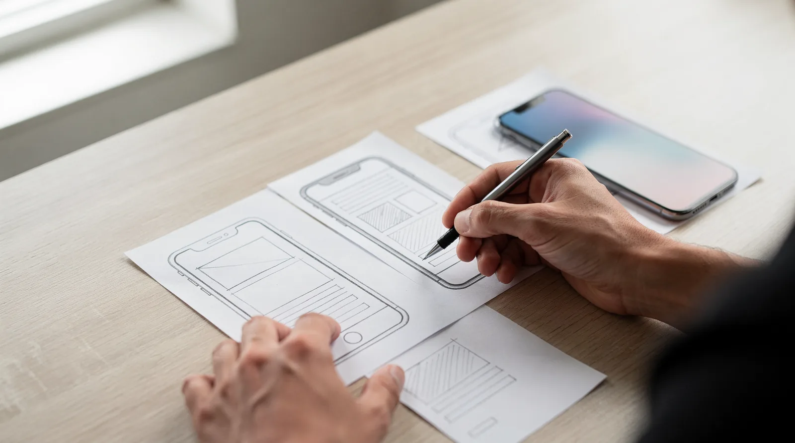
- Sketch the smallest screen layout first. Design work should start on a phone-sized canvas, not a desktop monitor. This approach to mobile first design locks in fast load times, clean navigation, and layouts that flex naturally as screen size grows.
- Trim the page down to essentials. Small-screen constraints force tough choices about what actually earns a spot on the page. Product photos, price, and the buy button stay; everything else gets pushed below the fold or cut entirely.
- Build navigation for thumbs, not cursors. Buttons need real tap targets and clear spacing. Skipping this step is exactly what produces the crowded menus and hard-to-tap buttons that plague adapted desktop sites.
- Scale layouts upward for tablets and desktops. Once the phone experience works, the same content structure stretches into responsive sites that reshuffle columns and images for bigger screens without breaking the core experience.
- Compress every asset for speed. Images, scripts, and fonts get optimized before launch, since fast loading pages keep shoppers from bouncing on a slow connection.
Why does design order matter so much?
Building desktop-first and adapting later almost always backfires. Teams end up bolting mobile fixes onto a layout that was never meant to shrink, which produces slow load times and buttons visitors can't tap accurately.
How many visitors actually use mobile devices?
Smartphones already account for 48.92 percent of all web traffic, nearly half of every visit a shop receives. Skipping any step above means ignoring the device almost half of all shoppers use to browse and buy.
Shop owners short on dev resources should treat step one as non-negotiable. Everything downstream — content priority, tap-friendly buttons, and page speed. Depends on getting the small-screen foundation right before scaling up.

What Mistakes Should You Avoid After Launch?
Shop owners lose momentum fast when they treat launch day as the finish line. Skipping a mobile first design approach after launch drags performance down across desktop and tablet screens too, not just phones. The whole site turns slower, messier, and harder to navigate on every device.
Does ignoring mobile updates hurt sales over time?
Smartphone traffic keeps climbing year after year. Shops that stall on mobile improvements keep losing ground to competitors building responsive sites that adapt smoothly to shrinking screens and growing customer expectations.
Common post-launch mistakes include:
- Freezing the design instead of testing new layouts on real phones.
- Letting catalog pages grow heavy, killing fast loading pages.
- Assuming desktop performance guarantees a smooth mobile experience.
Owners who keep refining the mobile experience stay ahead. Those who don't watch traffic — and sales — slip away.
Mobile-first design isn't optional anymore—it's your competitive edge. Fast load times, intuitive navigation, and seamless checkout experiences transform browsers into buyers. Prioritize what matters: crystal-clear product images, frictionless payment flows, and lightning-quick performance. Your customers demand it. Your bottom line depends on it. Build mobile-first today and watch your conversions explode tomorrow!
FAQ
Why is mobile-first design important for online shops?
Mobile devices generate over 60% of web traffic, and 72.9% of ecommerce sales happen exclusively through phones. Google also indexes the mobile version of a site first, directly impacting search rankings and visibility.
What should shop owners check before starting a mobile-first redesign?
Shop owners pull mobile traffic reports, check sales by device, and confirm that Google indexes the mobile version as the primary ranking version before touching any layout file.
How should navigation and buttons work on a mobile-first ecommerce site?
Navigation gets built for thumbs, not cursors, with real tap targets and clear spacing. Product photos, price, and the buy button stay visible while extra elements move below the fold.